According to stats, about 94% of first impressions are related to visual appeal, whether it is related to content or website navigation. An attractive site always garners the attention of prospects and create an incredible impression in the mind of customers.
However, the first impression is an integral part when it comes to website design. The researchers say people take only 0.5 seconds to create an opinion about your site. The reflection of your site tells them either they have to stay or leave your sites, which is why it is essential to design your website header creatively.
When your prospects find your business and looking for your website online for the first time, it is important to create a lasting impression. As per the research, it is revealed that 75% of business credibility and legitimacy come from web design. Bear in mind that a poorly designed website gives the sign of untrustworthy business.
So, for your website, a creative and engaging header is one of the most important things to attract readers. In this blog, you read the importance of an attractive website header and tips to design it perfectly.
Why Website Header Should Attractive?
A website header is a foremost thing that visitors look for when they find your webpage online. A good header should be clear and effective to attract readers and gives complete information they are looking for.
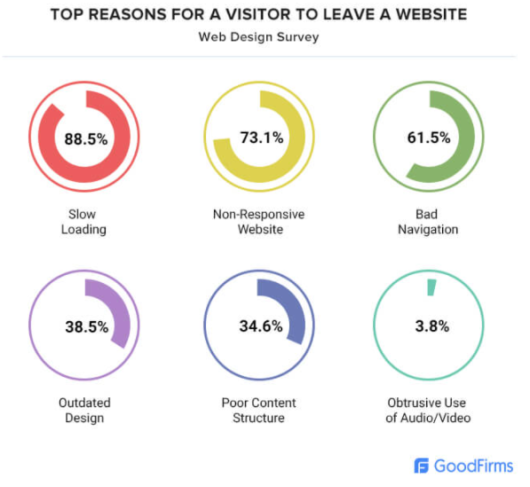
If you do not design perfectly, your customers do not want to stay on your website. As per the website designers, 73.1% of people leave the website to non-responsive design.

However, when you create your website header, keep in mind that the better first impression you create, the more your visitors stay on your page.
So, the key features to create a perfect header are; consider spacing, colors, structure, symmetry, and more. Here you read 8 top tips to design the perfect header for an eCommerce website.
So, let’s dive into the read!
8 Best Tips for Designing a Professional Website Header

Tip #1 – Use Readable Font Style
The headlines are the center stage of your brand site. As mentioned above, it is the first thing your visitors see. So, it is essential to use the right fonts that are clear and readable for your customers. Make sure your title must be bold, big, and clearly visible that attract the reader’s attention.
Avoid building a cluttered screen. If you add too many diverting elements, your visitors never understand where to look. it simply means you lose to build coherent experience. Make sure sub-headings and titles are clearly visible to readers.
Tip #2 – Must Use White Space
White space is also known as negative space. It is the term used in visual arts. When it comes to artistry, the negative space helps to improve legibility and also improves the visibility of the main subject. At the time, when you are writing the website header, surround the most integral components with negative space. The whiter space you add, the more attention it gains.
Make sure you do not emphasize the wrong element. Add negative space around components that should be your top priority.
Tip #3 – Add Illustrations
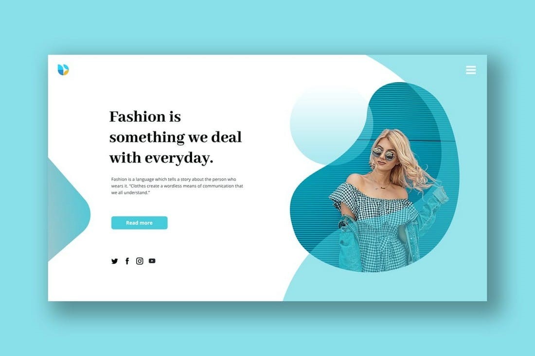
Using illustrations to your website header is also a great way to attract readers. Modern website designs use illustrations to make your brand site more attractive and appealing. Bear in mind that a great header with illustrations helps to build your website personality.
Ensure that the illustration you used perfectly with your business requirements. You can use a similar style of illustrations on your whole website to give a smooth experience. You can add captivating images with headers. Moreover, you can even enhance the website header with product videos.
Tip #4 – Create A Call-To-Action
The call-to-action is another most important part of designing the perfect header. When you add CTA, you can encourage your prospects to take action, search for items they are looking for, signup to avail of service, and subscribe to the newsletter. It even motivates visitors to buy the product from your site.
You have to be very careful when it comes to the placement of CTA. You can use the A/B split test that design your header and help you to find out the best color combinations to spot CTA.
Tip #5 – Header Size Matters
If you are tempted about your header size, there are no strict rules to keep the header size too big and too little. But make sure that your header design does not overwhelm or bore the audience.
When it comes to header sizes, you have to use your intellect. You have to consider that your header size does not look too small and too big. You have to create it on the standard screen size.
Tip #6 – Sticky or Non-Sticky Header
Many people are pondering which type of header is best, whether they need to go for sticky headlines or choose the non-sticky header. Usually, the sticky header gets more attention when compares to the non-sticky one. Choosing a sticky and fixed header for an eCommerce website, marketing, a blog is best. To build portfolios and personal sites, the non-sticky header is best. It is because they are not too big.
If you pick the non-sticky header, you must know that many pages have high exit rates. The reason is people have to look for the navigation link more than two to three times. But, no one likes to repeat it, especially when the site page is long.
Tip #7 – Optimize the Website Header for Mobile
This is the era of smartphone users, so it is imperative to optimize your header for tablets and mobile. Everyone knows that users are usually active on their mobile phones. Ensure that your website header is perfectly fit on mobile phone screens, tablets, etc.
When creating a header, your mobile header’s version does not exclude such items that appear on your desktop screen.
Tip #8 – Use Warm Colors
You all know that colors have their own meanings. And, warm colors are the most attention-grabbing tool that stimulates the emotion in an individual. You can add warmer colors in your headlines to gain readers’ attention more quickly.
Bear in mind that warmer colors are more attractive than cooler ones. You should use warmer colors to attract readers more quickly.
Resources:
- Laravel vs CakePHP: Which Framework is Better for Web Development?
- How To Ensure Cyber Security During Software Development
- How Machine Learning Is Powering a New Generation of App Development
Author: Christina Antony from eWorldTrade.


