Any online store owner holds a great interest in having a well-running and fruitful eCommerce store. They invest in new features, expand product lines, spend money on expensive marketing campaigns and influencers.
They even build progressive web applications or native apps to grow mobile sales. But are they doing everything right?
On this page, you’ll learn how to improve the customers’ shopping experience. You’ll find tips on what to (and what not to) do to grow your sales, as well as discover neat examples of the online stores of renowned brands to see how it’s done right.
5 Ways to Improve Online Customers’ Shopping Experience

Tip 1: Optimize the Store (Speed & Beyond)
The biggest eCommerce mistake that online business owners make deals with having an unoptimized website that can and should be performing better.
Buggy and “slothy” sites are your doom. Therefore, there’s no other solution other than to audit the site, find out what’s wrong, fix it and improve what you can. Otherwise, you’ll just continue losing your revenue and compatibility.
According to the findings and statistics by Akamai, a website load time delay of 100 milliseconds can reduce conversion rates by 7%. A page with more than three seconds load time will lose 53% of mobile site visitors.
So, investing in website optimization is a “must” to improve customers’ shopping experience. Where do you start?
- analyze user behavior and the store’s weak sides;
- get rid of those site solutions that just don’t work;
- and, for sure, make an accent on site speed (begin with your images that should be compressed in terms of size, since, as a rule, heavy pictures are a significant burden, slowing things down).
Tip 2: Untangle Navigation & Element Placement
User experience is another key point not to forget. Poor UX and UI decisions can be costing you the loss of your customers. It should be effortless to use your store; actually, it should be a blast.
Reasonable navigation and element choice are your primary focus here. It must be clear how to find something on your site and make your way from page to page.
If it’s not, people will hit the tab’s “X”, increasing your bounce rate. Let’s take the top site menu as an example. Preferably, it shouldn’t take more than three to four clicks to get to any product page from the first level of the menu. Plus, it should be optimized for mobile users (more on that in tip 3).
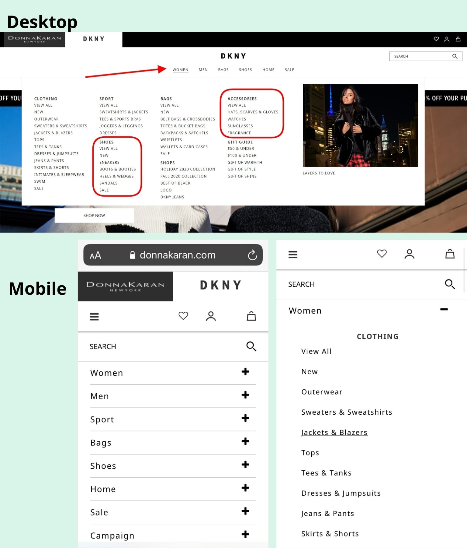
Case in point, this is how the top menu of the official DKNY website looks on the desktop and mobile screen. Do you see the difference? Did you notice that although there are so many product categories, it’s still easy to navigate regardless of the used device?

Tip 3: Make the Site Mobile-Friendly
And you do know that a large percentage of your customers use their mobile devices to shop, right? So having a well mobile-optimized website is a priority not to overlook. It directly influences your online sales.
The thing is that people tend to turn to their smartphones and tablets for shopping a lot more often recently. Thus, your site’s mobile version can’t be just a shrunk version of the desktop design. By all means, no.
The mobile-first approach is something to consider for enhancing the shopping experience of your users. What does it imply?
- It means that the menu and any other UX\UI decision you make should look good and feel good for mobile users.
- The elements must be thumb-reachable.
- Avoid weird pop-ups or anything that can distract the user and make them want to leave the site.
- Think about what you can change on your catalog pages, product pages, and checkout so that it’ll be easier to make orders. Furthermore, many companies are already looking into the fintech trends and are gradually adopting progressive payment solutions to prepare their business for other future changes.
Tip 4: Take Care of the 404 Error Page
Can you imagine anything more discouraging than clicking on a link and seeing that the page doesn’t exist? It’s a 404 Error Page that occurs when a user tries to access a misspelled link or a URL address that can’t be located on the Internet.
Where could the page go? It happens when the website administrator has removed the page or the entire resource.
What can you do in such a situation as an online store owner? There are some options:
- creating a generic 404 page with an alert about the problem;
- setting a redirection to the homepage;
- optimizing the error page to boost your sales.
The first two variants suggest that your customers will look for ways to convert themselves, but I wouldn’t be so optimistic. Chances are they’ll just close the website if they don’t get what they want.
What you should do is set up a decent separate landing point on the 404 Error Page, also known as a “Page Not Found”:
- provide search functionality;
- link to other pages (most popular items, browsing history recommendations);
- help visitors navigate with the help of a map of your site;
- use a conversational tone (you may add humorous error messages to reduce frustration);
- add a call to action to your 404 page to encourage potential customers to click on the links;
- explain why they arrived at that page and suggest other activities, such as subscribing to email newsletters or social media.
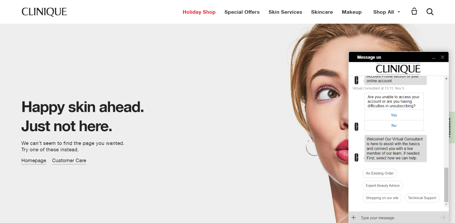
Below is the Clinique 404 Error Page. It allows you to go to the homepage, FAQs, other website categories or get customer support in the live chat with a virtual assistant.

https://www.clinique.com/1234
Tip 5: Sustain Strong Online Presence
The final fifth strategy to improve customers’ shopping experience that I’d like to bring up deals with your store’s online presence. Having just your eCommerce site alone isn’t enough in the modern world. Your brand needs to be present across all the channels that it can. Foremostly, this includes social media.
For this reason, you should take care of your brand visibility. One of the ways to do that is to have a smart social media strategy. Get accounts on Facebook, Instagram, Pinterest, even TikTok or LinkedIn if you feel these social media platforms make sense for your business needs. After all, you can run ad campaigns and connect with your audience.
Oh, and did I mention that you can start selling more using social media? By tying your online store’s catalog to the business accounts on social media, you get the chance to tag products that you display in your posts. This makes it possible to buy something from you at the convenience of browsing favorite social media sites.
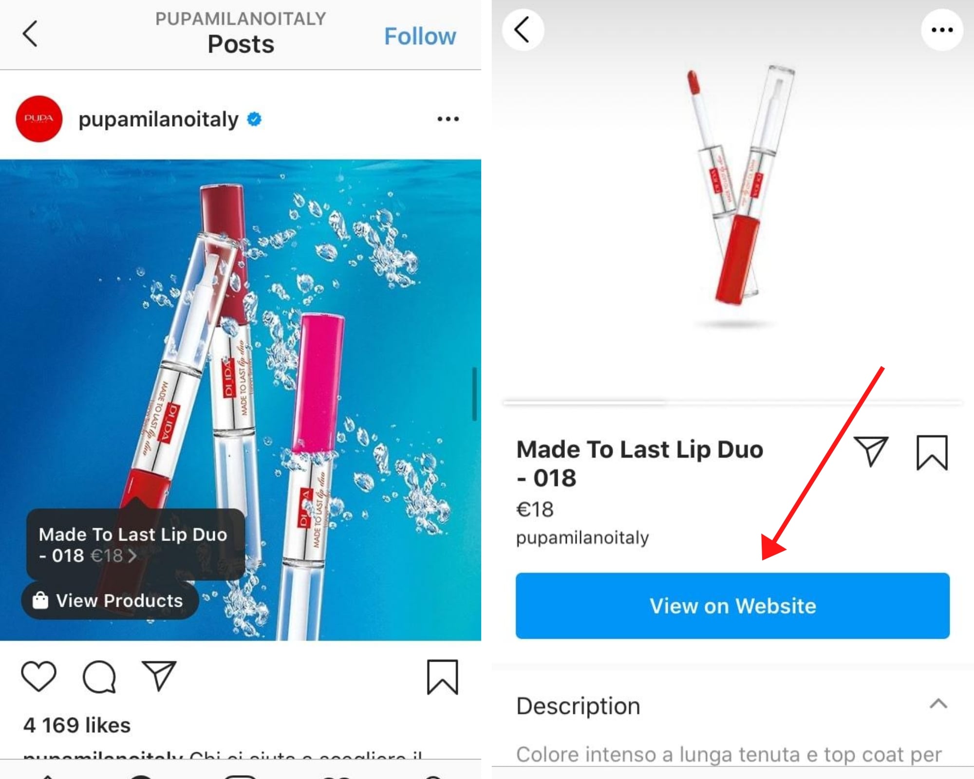
Look at the screenshots from the official Instagram account of Pupa Milano. As seen on the left, the product that’s shown in the picture has a tag. You see its price and a handy “View on Website” button if you tap on it. The button takes the user straight to the correlating product page on the online store where the item can be bought. Smashing, right?

Of course, running all these channels requires a deal of time. Luckily, it won’t be that hard to have all of these accounts “alive” with good planning. Why? Because cross-linking, reposting, and cross-posting is already a big deal of your content plan.
In Closing
To sum up everything covered in this post, your online store’s success lies in your hands. You won’t go far without optimization and improvement, a broad cross-channel presence online, or a well-handled and mobile-optimized website.
In addition, you must make sure that your site is secure so that the shoppers won’t worry about the safety of their personal data. Thus, don’t stop at what you have already achieved and continue to speed up and SEO-boost your site to help it win over more clients and outplay your competitors.
Read Also:
- 10 Simple & Cost-Effective Ideas Guaranteed To Boost Customer Engagement
- 4 Trends That Will Define Customer Service in 2021 & Beyond
- 6 Critical Things To Know About Customer Lifetime Value (CLV)
Author Bio:

Kate Parish, chief marketing officer at Onilab, a full-service Magento development agency, with 8+ years of experience in Digital Marketing and website promotion. Kate always strives to stay in pace with the ever-advancing online world. Her expertise includes in-depth knowledge of SEO, branding, PPC, SMM, and the field of online sales in general.


